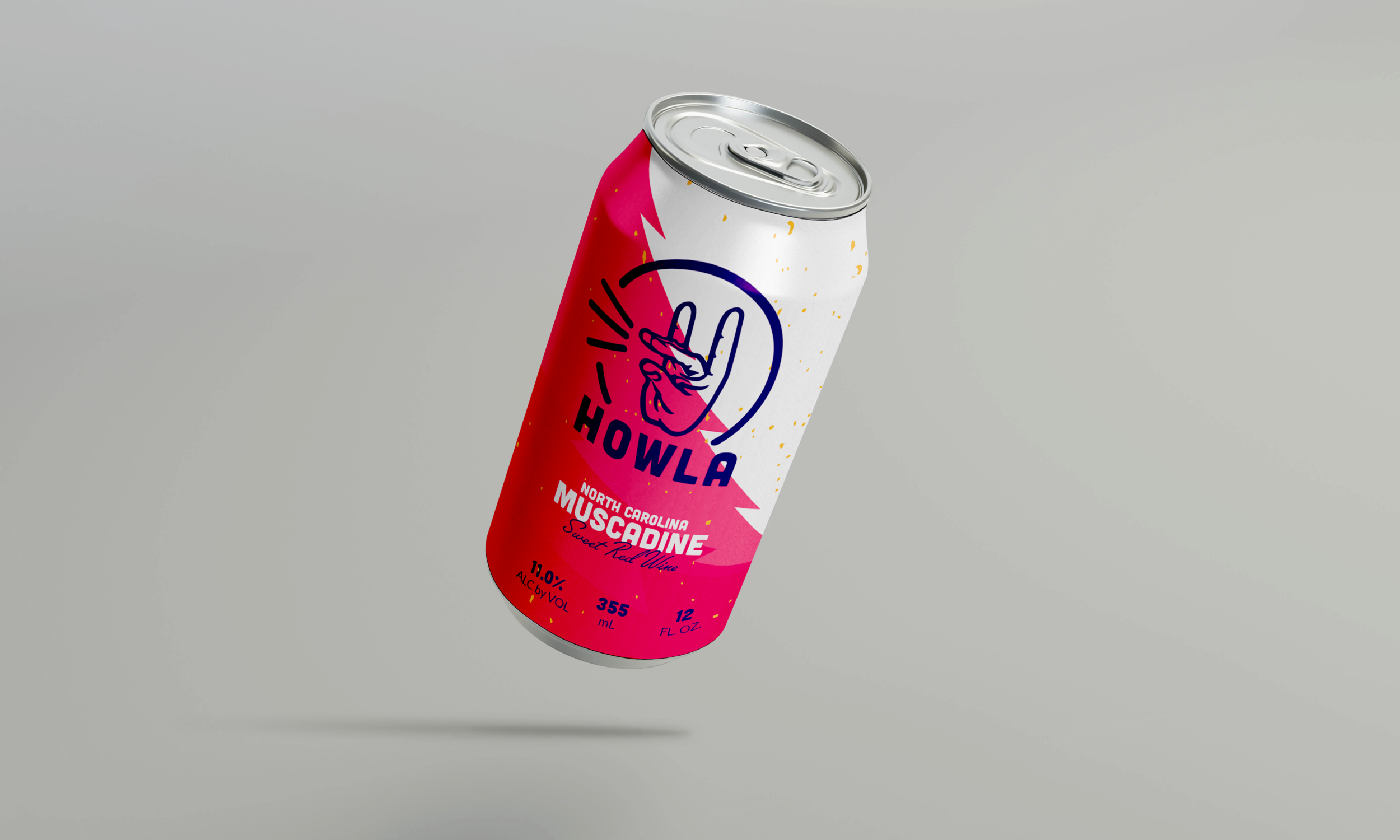
Howla
Packaging design for NC State University
Intent: to place this Muscadine wine as a competitor to Seltzers, hard ciders, and high alcohol content beers.
Name: I chose Howla because it is unmistakably NC State while being something one would want to associate with even if they weren’t affiliated with NC State. It has huge potential for other brand and marketing materials such as the hashtag included in the design. On top of all that it just rolls off the tongue when in conversation.
Logo: Classic but modern with a twist on the classic Wolfie hand symbol/graphic. It is also modular and could be easily applied to merchandise and other products.
Scaling: It was designed for the potential of expanding to Seltzers and other beverages while still under the Howla.
12oz can design
Carton design and copy
Standard 750mL bottle


